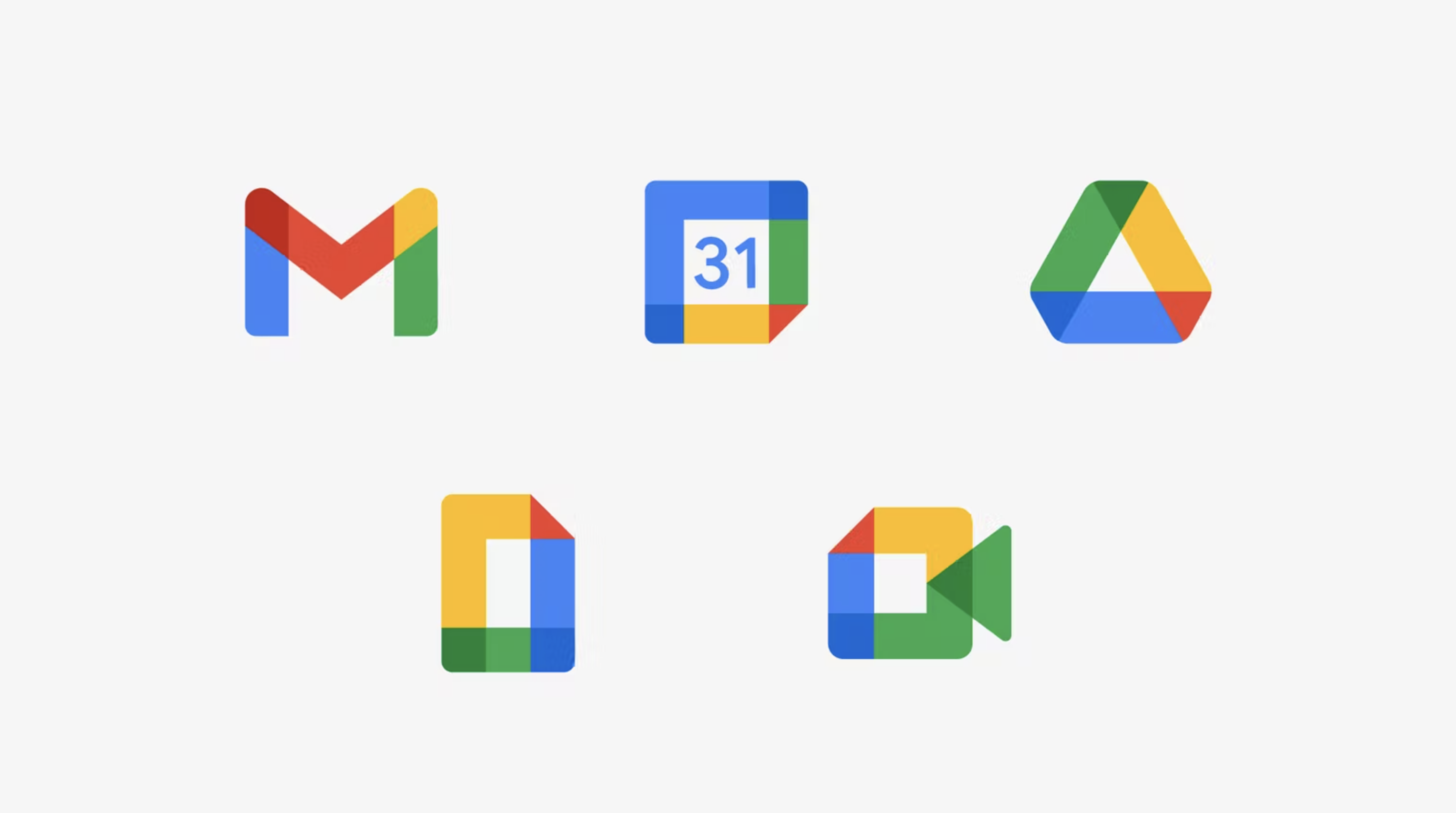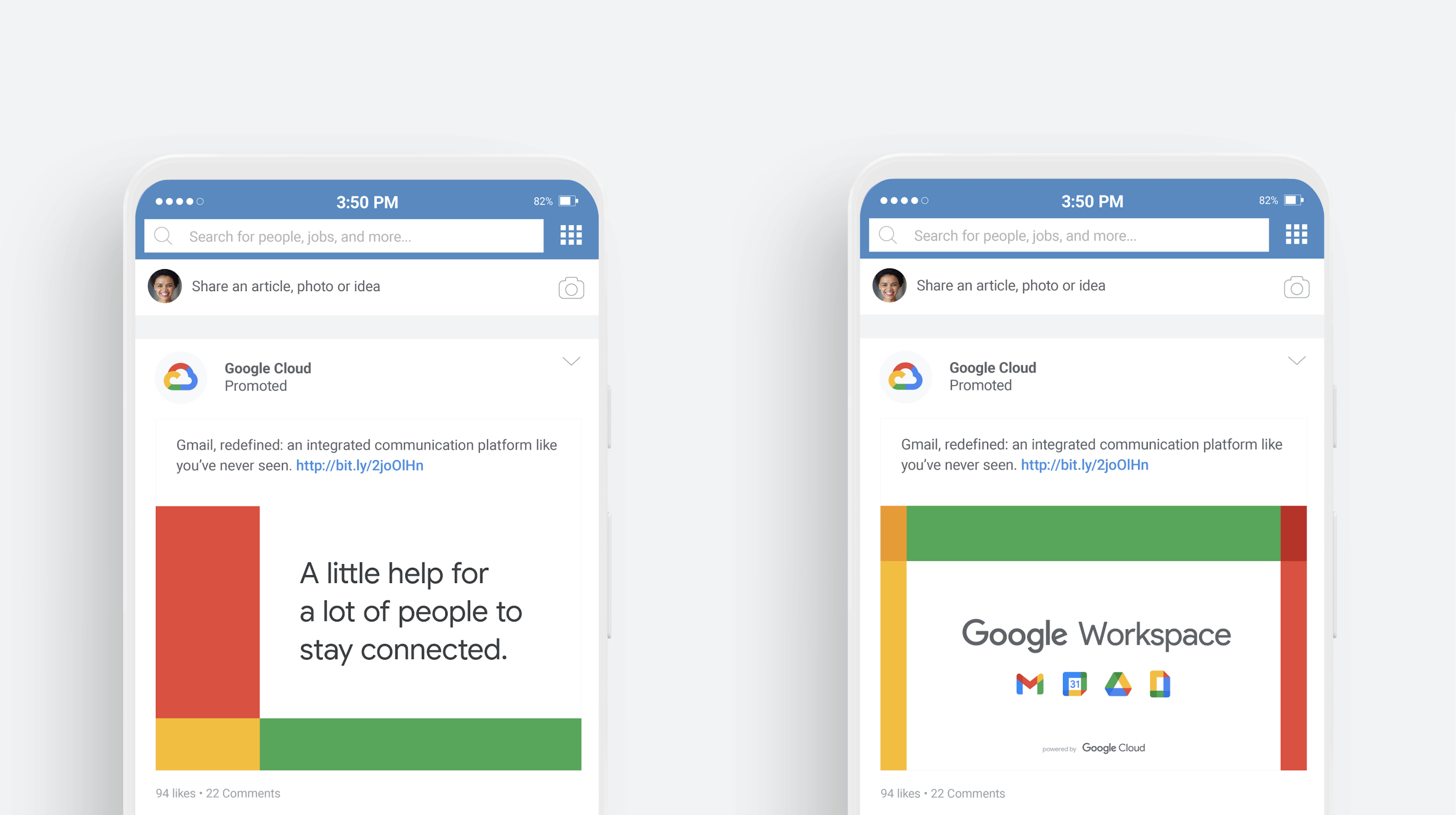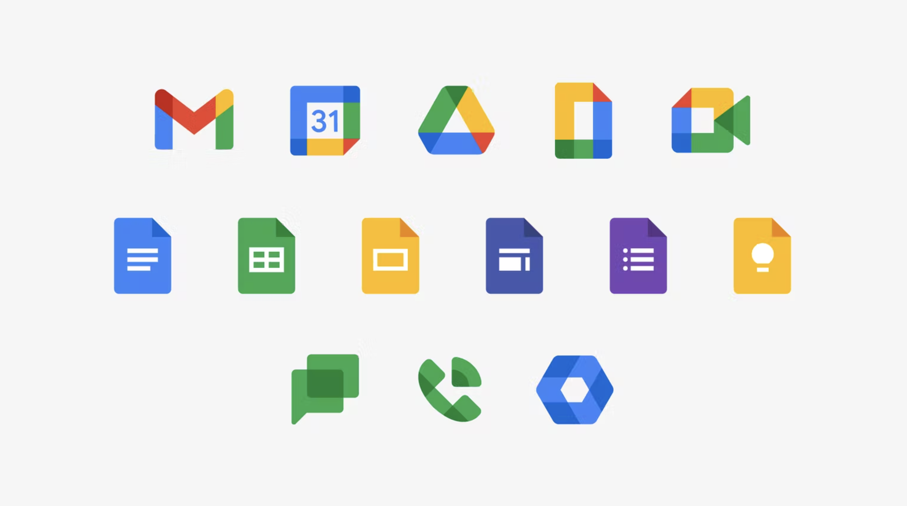
At Wolff Ollins, we were chosen by Google to redesign the product icons into a more unified set, to help users understand the deeper integrations.
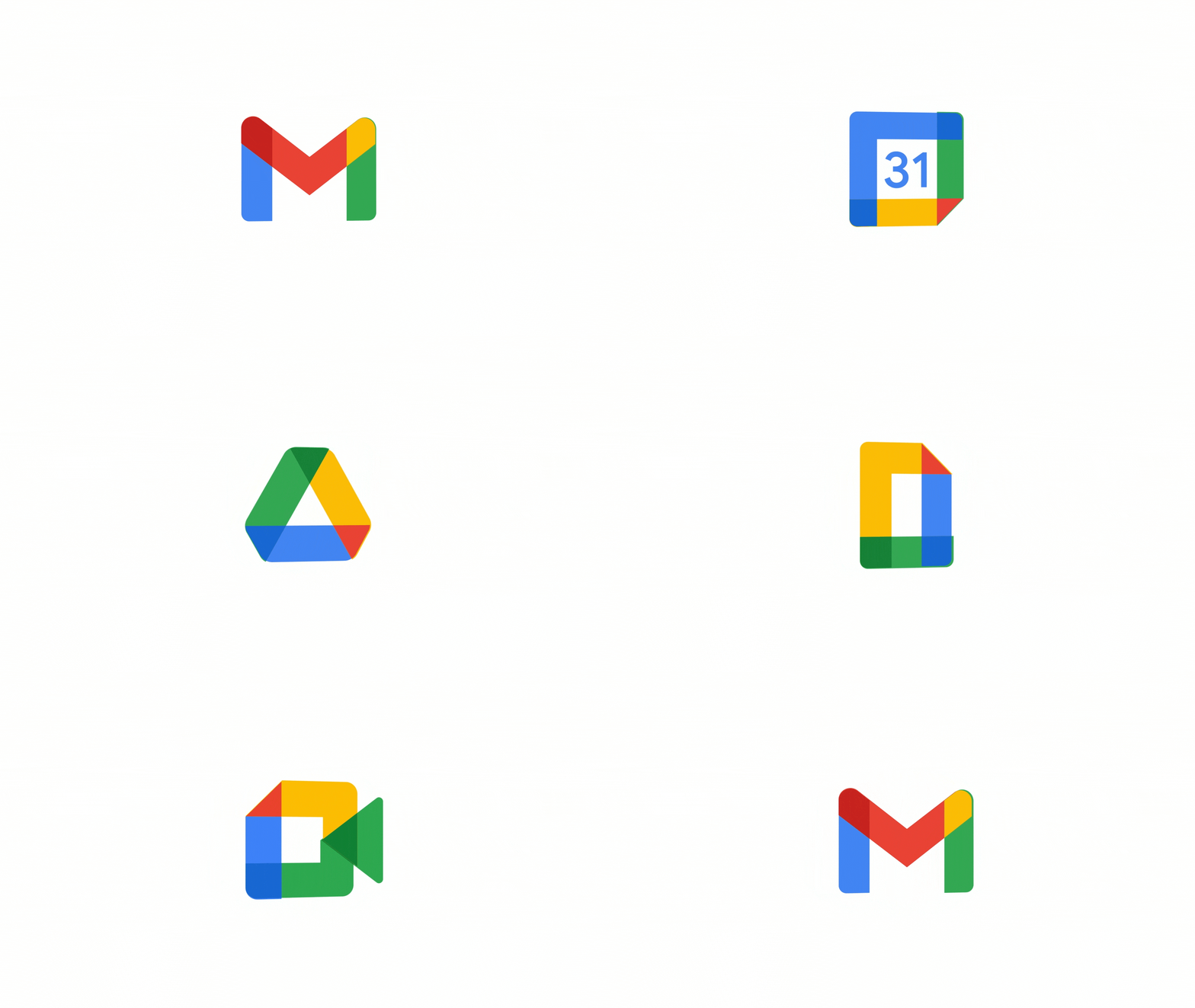
With 3 billion active users and well-known brands like Gmail, Calendar, Docs and Meet, we needed to find a solution that both made sense of the new offer and retained the individual product equity and relationship to Google. The white space in all the flagship icons (Gmail, Calendar, Drive, Meet, Editors) is a space for communication, collaboration, and creativity – as promised by the Google Workspace name.

We landed on a new territory for Google based on ‘transparent layers’ that overlap and extend from one app to the next, signaling the deeply integrated user experience, and people collaborating all over the world simultaneously.

